CASE STUDY
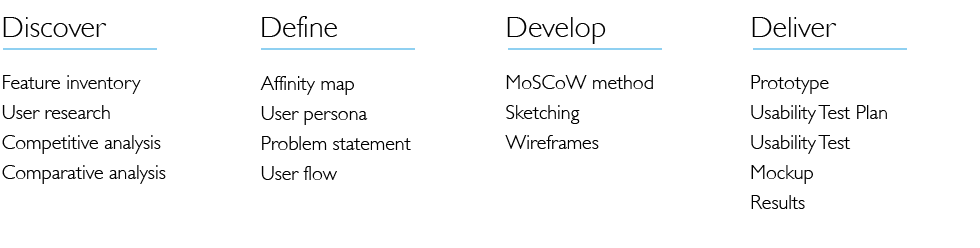
Project Overview
In this project, I was working with a team of UX designers. We designed a new feature for an existing brand Forward Healthcare in order to meet their business goal. We focused on the iOS app and the Virtual Booking Appointments feature and worked to improve the usability, navigation, and overall design of the existing mobile app interface through extensive user testing and research. We split our tasks equally, so every team member could be involved in each step of the process. We then selected leads for every phase of the project.
The "Thundercats" team
Jim Senti
Lauren Macias
James Ross
Julia Larina
Lauren Macias
James Ross
Julia Larina
My role
User interview
User research
Competitive and Comparative analysis
UX and UI Design of the calendar
MoSCoW method
Usability test
All deliverables and Presentation
User research
Competitive and Comparative analysis
UX and UI Design of the calendar
MoSCoW method
Usability test
All deliverables and Presentation
Background
According to the Centers for Disease Control (CDC), 7 out of 10 U.S. deaths are caused by chronic disease, including heart disease, cancer, diabetes, AIDS, or other conditions classified by the medical community as preventable. Forward is a healthcare provider that is mainly focused on personalized, preventive healthcare using advanced technology. They use sophisticated technology to reduce healthcare’s massive headcount and costs. They use software that integrates all the data — from genetics, to blood testing, to sensors at home — to help patients proactively, instead of waiting for issues to arise.
Feature inventory
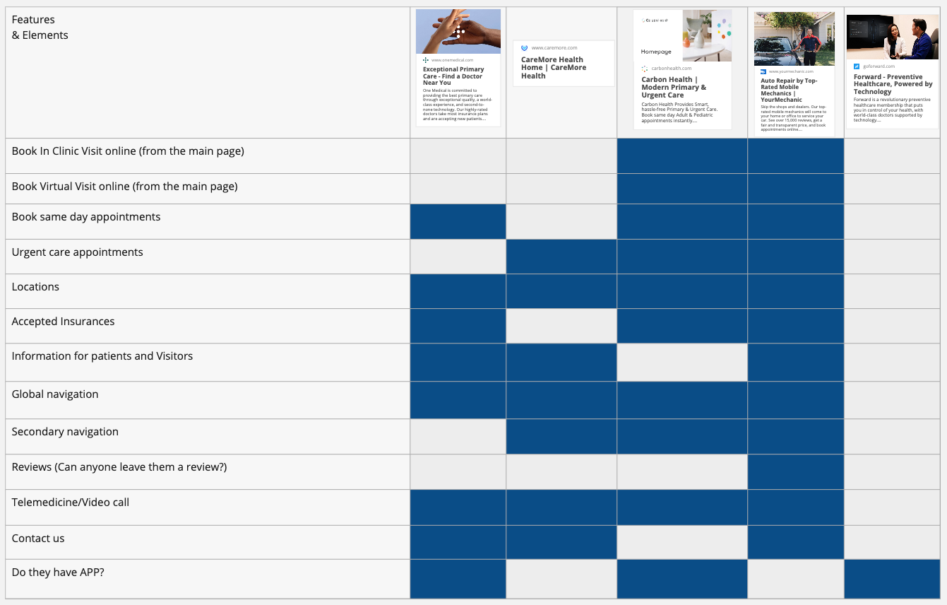
Each of our team members started from the research about company and in my research I found this Forbes article that describes Forward's goals better than the "About us" information on their own website. I read all the customers reviews on Yelp, in the App store, and on their Facebook page. The Forward App don't have much information to analyze, but we noticed that their onboarding is too long and we paid attention to elements for our design system. I did the feature inventory looking for competitors and best practices. We filled out the table for Competitive & Comparative Analysis with direct and indirect competitors: One Medical, Care More Health, Carbon Health, Your Mechanic
User research
Together with the team we came up with user interview questions and conducted 4 user interviews. I conducted 1 user interview. The insights from the user interviews were synthesized into an affinity map, using collaborative whiteboard Miro App. Now we had our "I am statements" and all the research kind of came down to three key takeaways that we were inspired by:
Takeaways
. Options
. Control
. Communications
. Options
. Control
. Communications
I am statements
. I want multiple options to schedule appointments;
. I want to access my medical info on my phone;
. I want multiple communication options for my doctor and nurses.
. I want multiple options to schedule appointments;
. I want to access my medical info on my phone;
. I want multiple communication options for my doctor and nurses.
Problem statement
Next step was to create a user persona, and we created the Persona Chloe. We highlighted her needs, goals, and pain points, and it helped us conclude her problem statement:
Next step was to create a user persona, and we created the Persona Chloe. We highlighted her needs, goals, and pain points, and it helped us conclude her problem statement:
"Patients, like Chloe, need an efficient way to access and schedule their appointments, because they want to feel more in control of their healthcare."
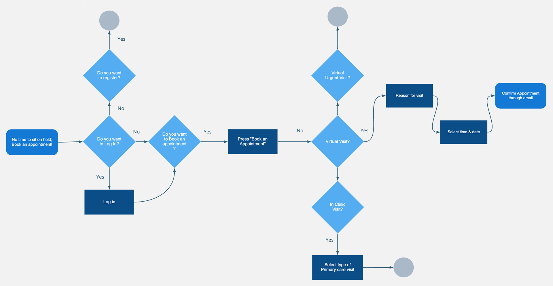
After this we started the ideation process. We sketched different ideas, created the user flow, and split the tasks, who is designing what part.
MoSCoW Method
I was the one who was responsible for feature prioritization. So I used the MoSCoW technique to help indicate what features have highest priority.
I was the one who was responsible for feature prioritization. So I used the MoSCoW technique to help indicate what features have highest priority.
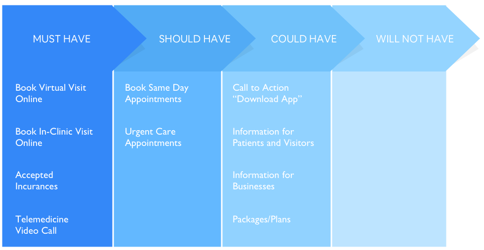
I decided that Must-have features are features that are covering business goals and user needs, but don't need the change of the business model or additional headcount, or big expenses. Should-have features are the features that need the change of business model and the increase of headcount and costs.
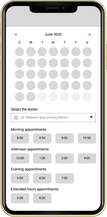
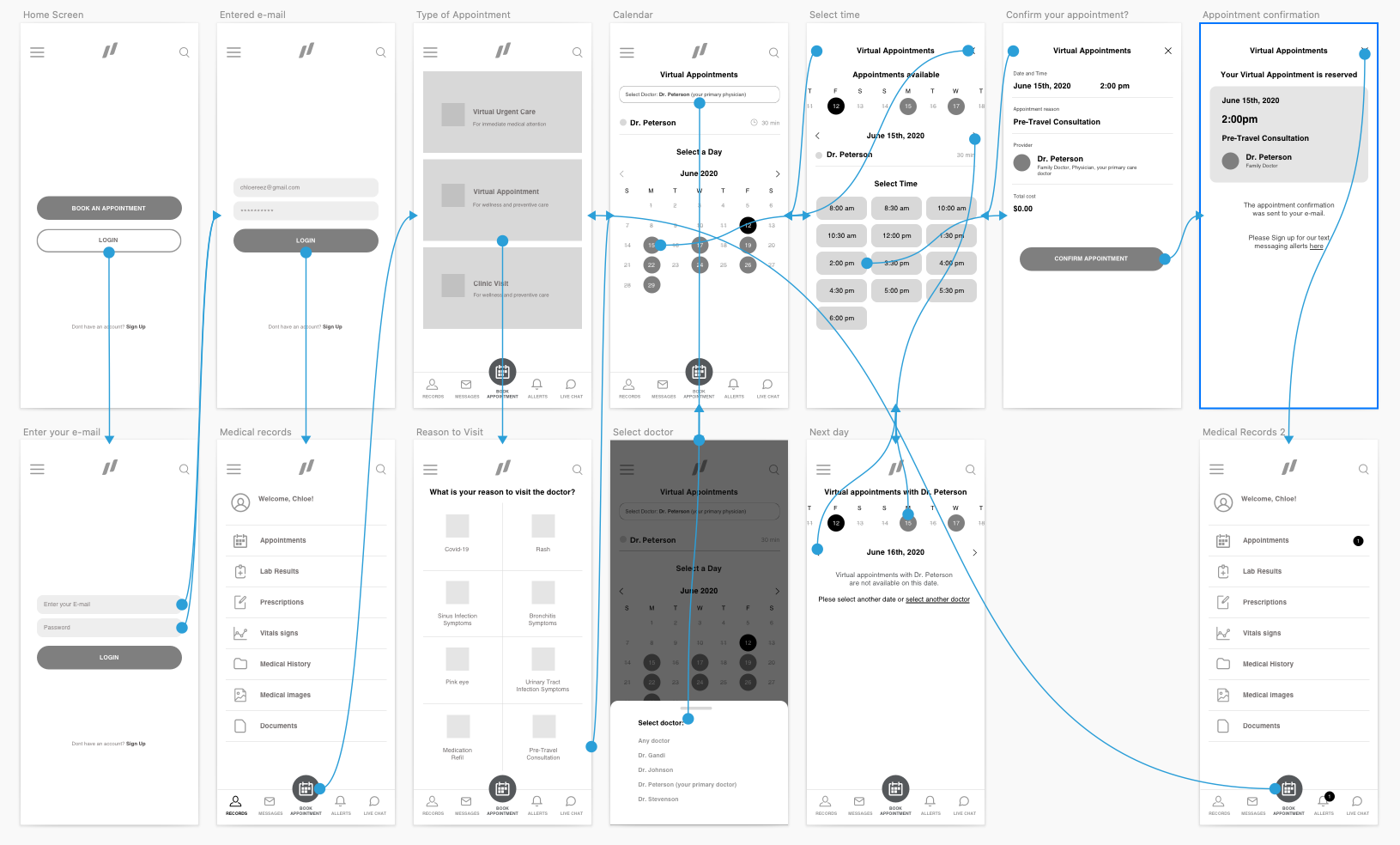
From Sketches to Digital Wireframes
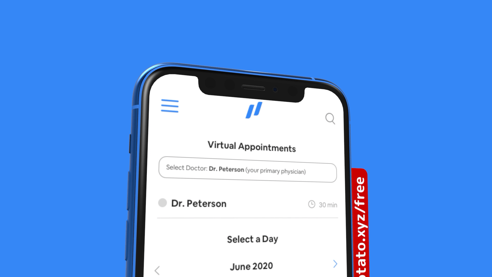
My responsibility was to design the Calendar. I sketched some ideas, I was trying to give users option to select date, doctor, time and filter all appointments by morning or afternoon sessions. Later I decided to remove the option "Select time" and split "Select date" and "Select time" into two screens, so user wouldn't feel overwhelmed and finished steps one at a time.
My responsibility was to design the Calendar. I sketched some ideas, I was trying to give users option to select date, doctor, time and filter all appointments by morning or afternoon sessions. Later I decided to remove the option "Select time" and split "Select date" and "Select time" into two screens, so user wouldn't feel overwhelmed and finished steps one at a time.

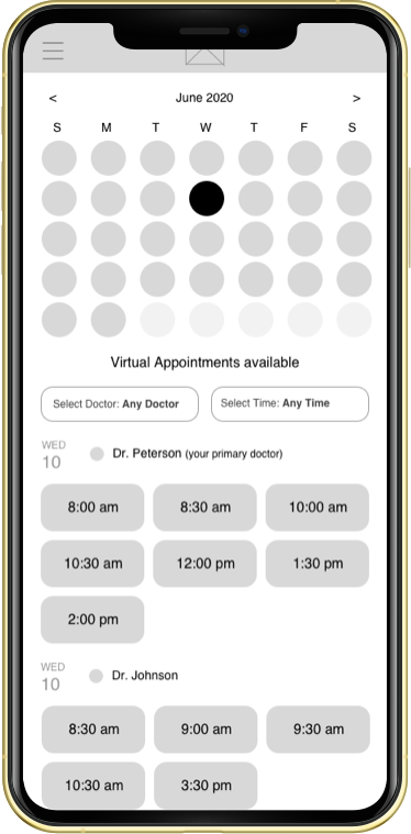
Prototype #1
When our prototype was ready, we created the usability test scenario and conducted 4 moderated remote and in-person usability tests. As a result all users were able to finish the task with 7 clicks in less than 4 minutes.
Usability Test Takeaways
. All users mentioned how clear and easy the flow was;
. Users mentioned the desire for urgent care feature;
. They were complaining that some icons were confusing;
. All users mentioned how clear and easy the flow was;
. Users mentioned the desire for urgent care feature;
. They were complaining that some icons were confusing;
. They were confused on what the difference is between "Appointments" and "Book Appointment";
. Users expressed the importance of messaging.
Iterations
I summarized all the takeaways and designed my version of the wireframes and prototype. I didn't conduct the second usability test yet.
Next Steps
I started working on the Mockup. On my next steps I would conduct Usability Test #2 and continue my work on the mockup and next tasks by priority.
First I would implement the urgent care feature. So patients, like Chloe, had an option to book same day appointments. This feature will cover the user's need in empathy and expand the communication option. In order to provide multiple options to schedule appointments, I would focus on developing a tablet version. I would also like to focus on onboarding, because the current Forward App has lengthy onboarding.
Summary
Our research showed that people prefer clinics where they can get all the necessary information, make an appointment with their doctor or see the results of the test anywhere and anytime. So we hope all those features will cover the user's needs and help Forward positively affect customer loyalty.