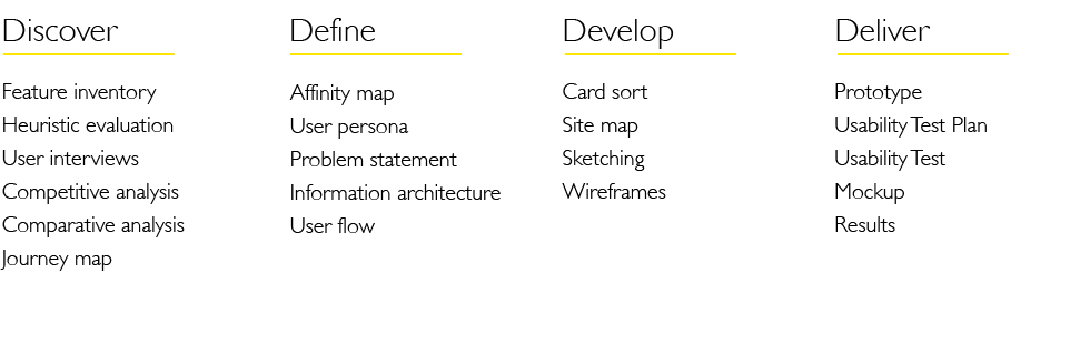
CASE STUDY
Project Overview
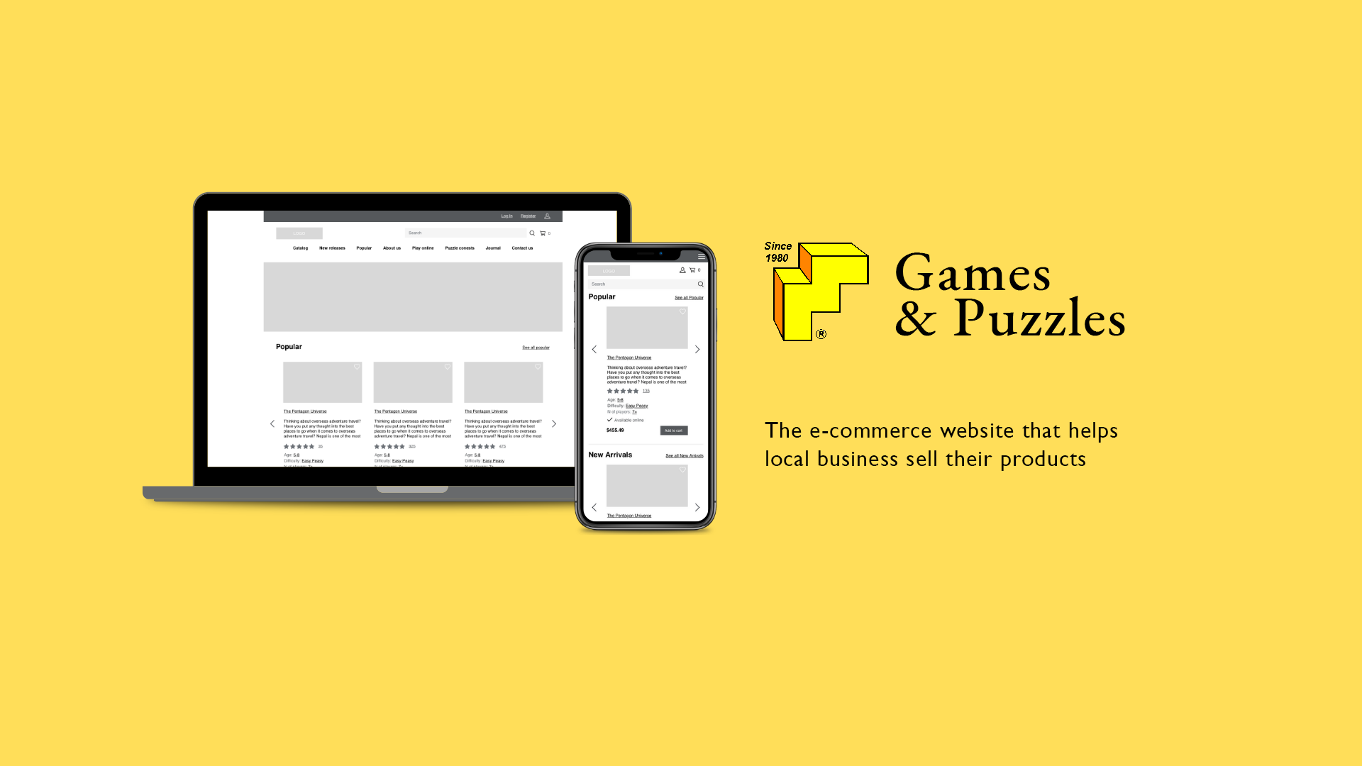
The redesign of an e-commerce website for a local store*. Their business model is based on customer service, reasonable pricing, and keeping it local.
Duration: 2 weeks
Company: Kadon Enterprises, Inc.
My Role
I conducted user research to understand my user's needs, behaviors and expectations. Competitor & best practice research helped me with Information architecture analysis and redesign. During the ideation phase I sketched some low fidelity wireframes, and quickly came up with solutions that aligned with the business goals and user needs. Then I created high fidelity wireframes and the prototype, and conducted usability tests. You can find the whole research and design thinking process, as well as usability tests results down below.
Background
"Gamepuzzles" is a mom and pop store incorporated in the State of Maryland on June 18, 1980. The company was founded by two married couples. The owners are taking the positions of webmasters, game designers, sales managers and the president. Their goal is to make and sell good and true beautiful things at decent prices. Each product must be worthy of the customers time and money. From their short overview I understand that the owners really love what they are doing. I can see that they update content regularly and use their website as a blog or a dairy or a history archive, so they are very attached to their website. In order to help them I need 1) to get rid of their bias and 2) improve user experience to help business owners to reach their business goals.
Heuristic Evaluation
So I started my work from heuristic evaluation. At first glance the website looks like a normal website, it has visual structure and menu, but when I dived dipper, I realized that heuristic evaluation failed in many ways:
. Aesthetic and minimalist design: This website contains information which is irrelevant or rarely needed on the main page, in the catalog or product page. Too much text information about the company, owners and their friends, competes with the units that supposed to sell the products, and diminishes their visibility.
. Consistency, Flexibility and efficiency of use: The navigation and description makes the user wonder whether different words or actions mean the same thing. There are no instruments to help a new user speed up his search, no sorters and no filters.
. User control and freedom: If the user choose a category by mistake the website doesn't have an "emergency exit", no breadcrumbs, no way to go back to the catalog from the product page, and when you press the logo it doesn't lead you to the main page.
. Match between website and the real world: The website doesn't really speak the user's language, many words and phrases are not familiar to the new user or mislead him. The information does not appear in a natural and logical order.
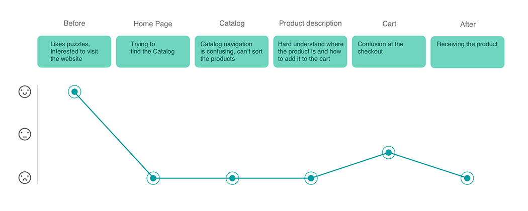
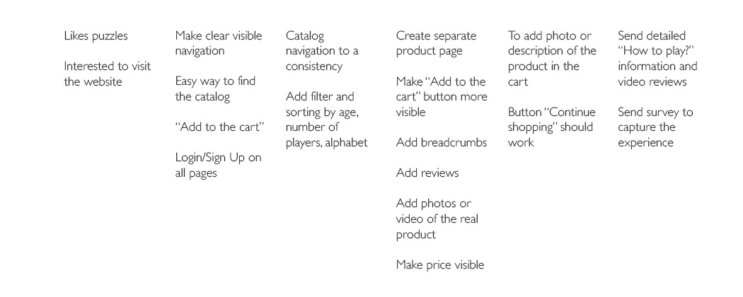
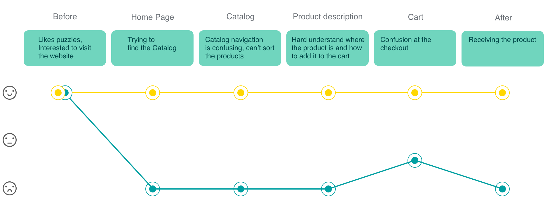
Journey map
This is where I stepped into my users shoes and it helped me to understand the user's needs and identify opportunities for improvement. Journey map shows us the level of users satisfaction.
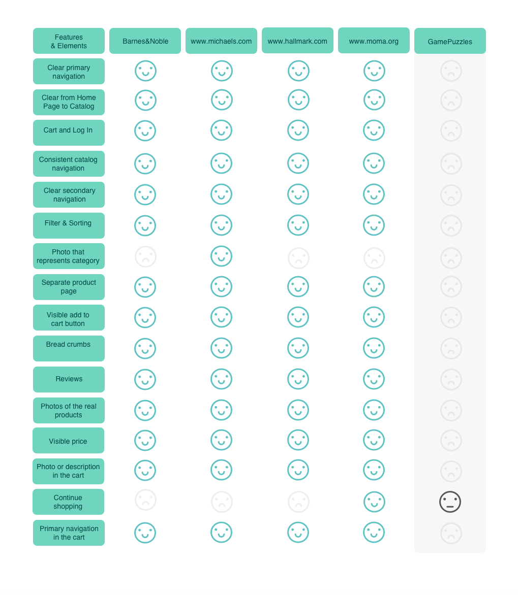
Competitive and Comparative analysis
I used takeaways from my Journey Map and conducted a Competitive and Comparative analysis, to see what features and elements our direct and indirect competitors have and what they don't. Competitors: Barnes and Noble , Michaels , Hallmark , MoMa gift shop
User Research
I conducted 3 user contextual inquiries, observed their behaviors, turned the observation into insights and synthesized my research into an affinity map.
I conducted 3 user contextual inquiries, observed their behaviors, turned the observation into insights and synthesized my research into an affinity map.
User Personas
It is important to create an understanding and empathy around user needs for the entire product team, including designers, product managers, and engineers, so I created my user personas. According to my research I created two user personas. Primary Persona is a parent, who buys games and puzzles for her kids, and Secondary Persona is an adult who likes to collect good quality games and loves to give them as a gift for friends and partners. For this project I focused on Primary User Persona.
It is important to create an understanding and empathy around user needs for the entire product team, including designers, product managers, and engineers, so I created my user personas. According to my research I created two user personas. Primary Persona is a parent, who buys games and puzzles for her kids, and Secondary Persona is an adult who likes to collect good quality games and loves to give them as a gift for friends and partners. For this project I focused on Primary User Persona.

Primary User Persona
Lisa Stevenson
Female, 39 y.o., married, has 2 kids.
Uses a computer daily, online shopper

Lisa is a corporate worker, and after a long day she prefers to spend her time with kids and family. She is a smart person, who loves to challenge her kids with logic problems. She believes that the best gift is a game, and every time her kids deserve a gift she buys them a puzzle or a board game. She thinks it is an excellent way to train their brains, to keep them busy and to develop their logic and creative thinking.
Needs and Goals
She wants to order board games online, but she has a difficult time finding a game for a specific age and catalogs of games are endless. She needs an easy way to select the game and order it online.
Pain Points
1) Navigation and catalog instruments are not helping her select the game that will suit her needs;
2) Experienced frustrations during the checkout.
Problem Statement
"Online shoppers, like Lisa, need an easy and convenient way to order games and puzzles for their kids, so they can easily select the game that suits their needs from the catalog, add it to the cart and not to feel stress during the checkout process."
How Might We Solve the problem?
1) How might we help her easily search and select the product?
2) How might we make the decision about what product to buy easier for her?
3) How might we make the checkout process less stressful?
2) How might we make the decision about what product to buy easier for her?
3) How might we make the checkout process less stressful?

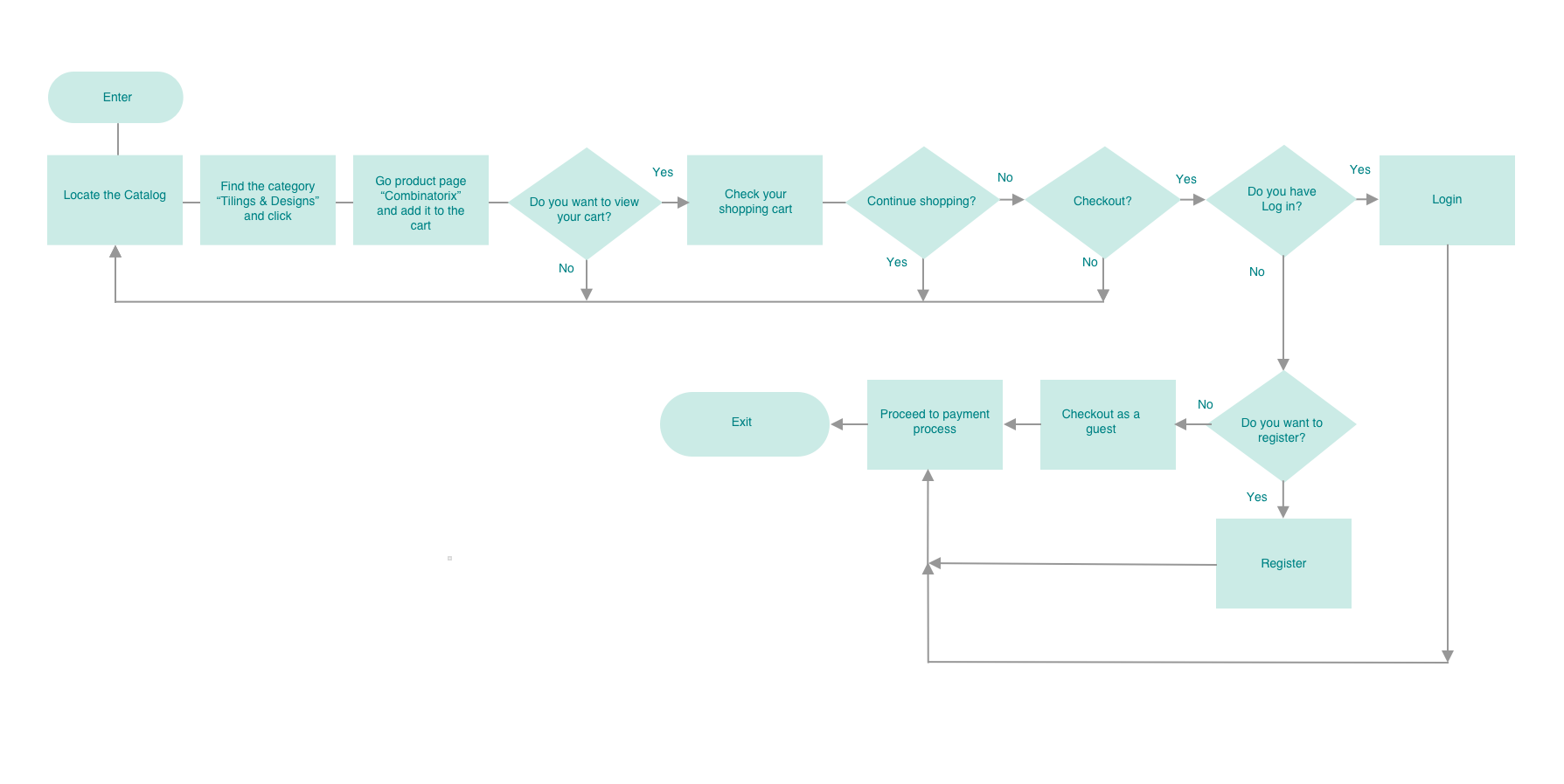
User Flow Chart
These steps helped me understand how to help the user make less steps (clicks) to achieve their goals faster.
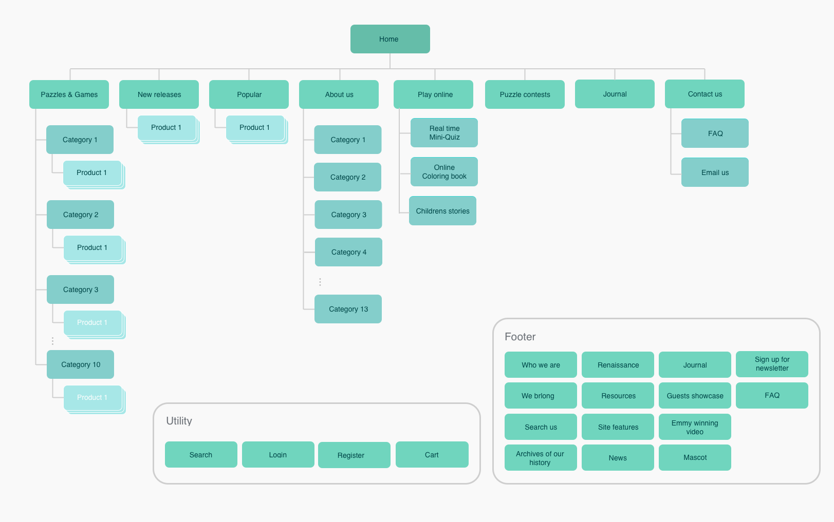
Card Sorting and Site Map
I did Closed Card Sorting twice using Optimal Workshops instruments. After the first time I realized that it wasn't clear to the testers what the name of each category means. For example, the title "New stuff" means "News" , but many testers thought it was "New releases" etc. So I renamed them to make it more understandable and did the card sorting a second time. This time it was more helpful and I could create the site map that helped me visualize how different pages are connected in a way that will make sense for user. It helped me improve information architecture.
Sketches
While I was sketching low fidelity wireframes, I came up with the several different solutions, that helped me align business goals with user's needs.
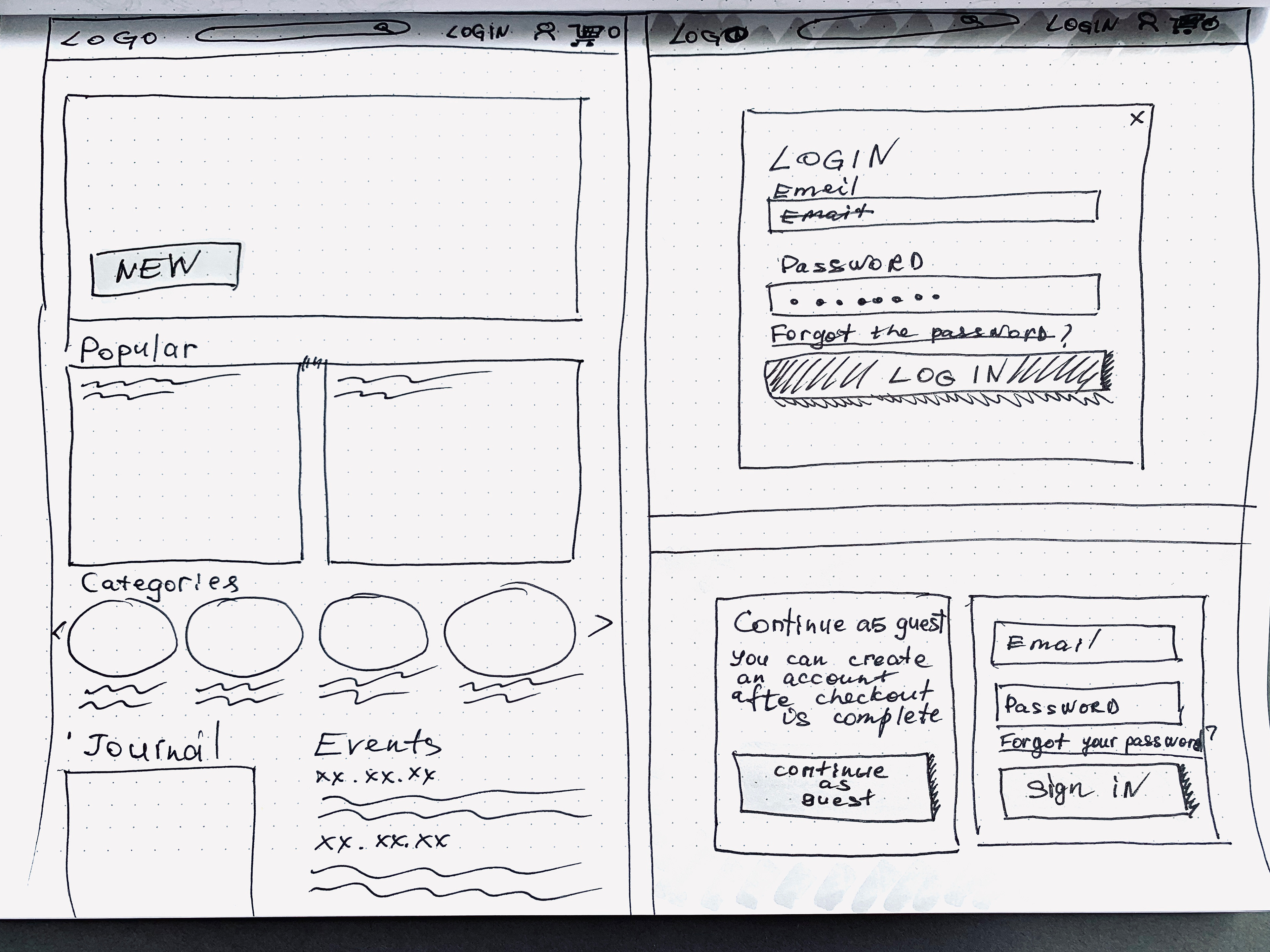
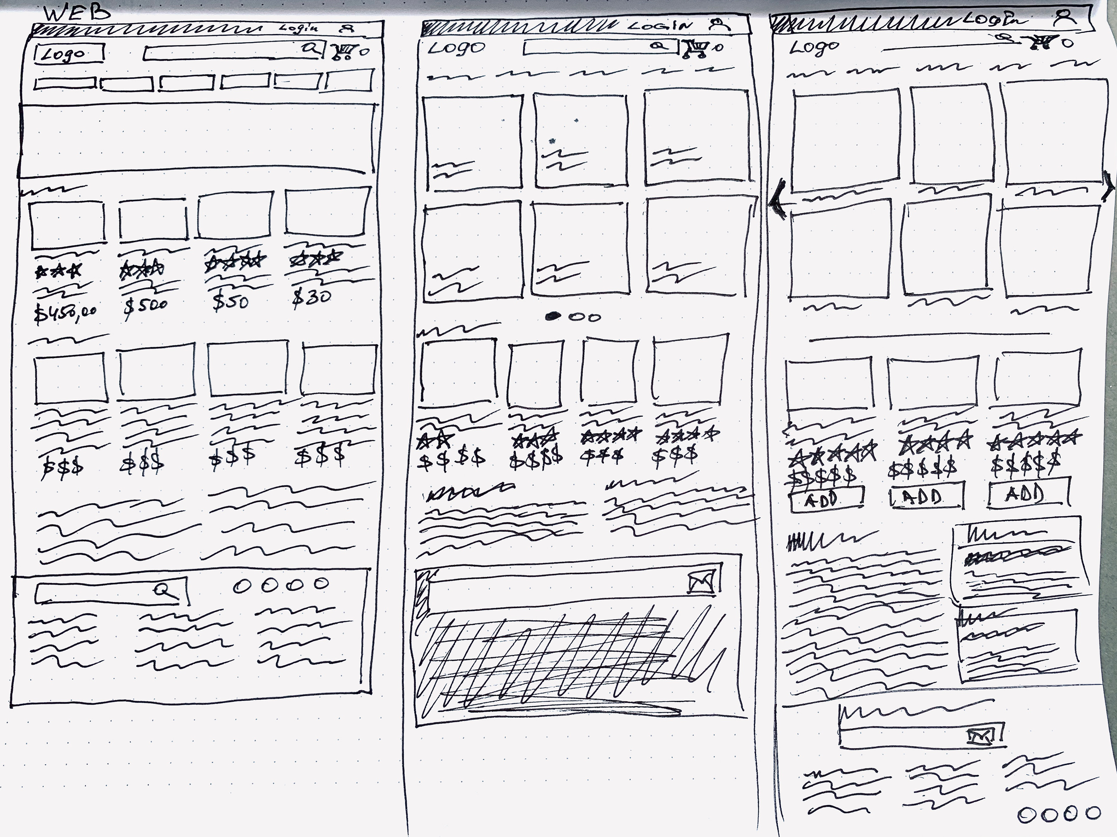
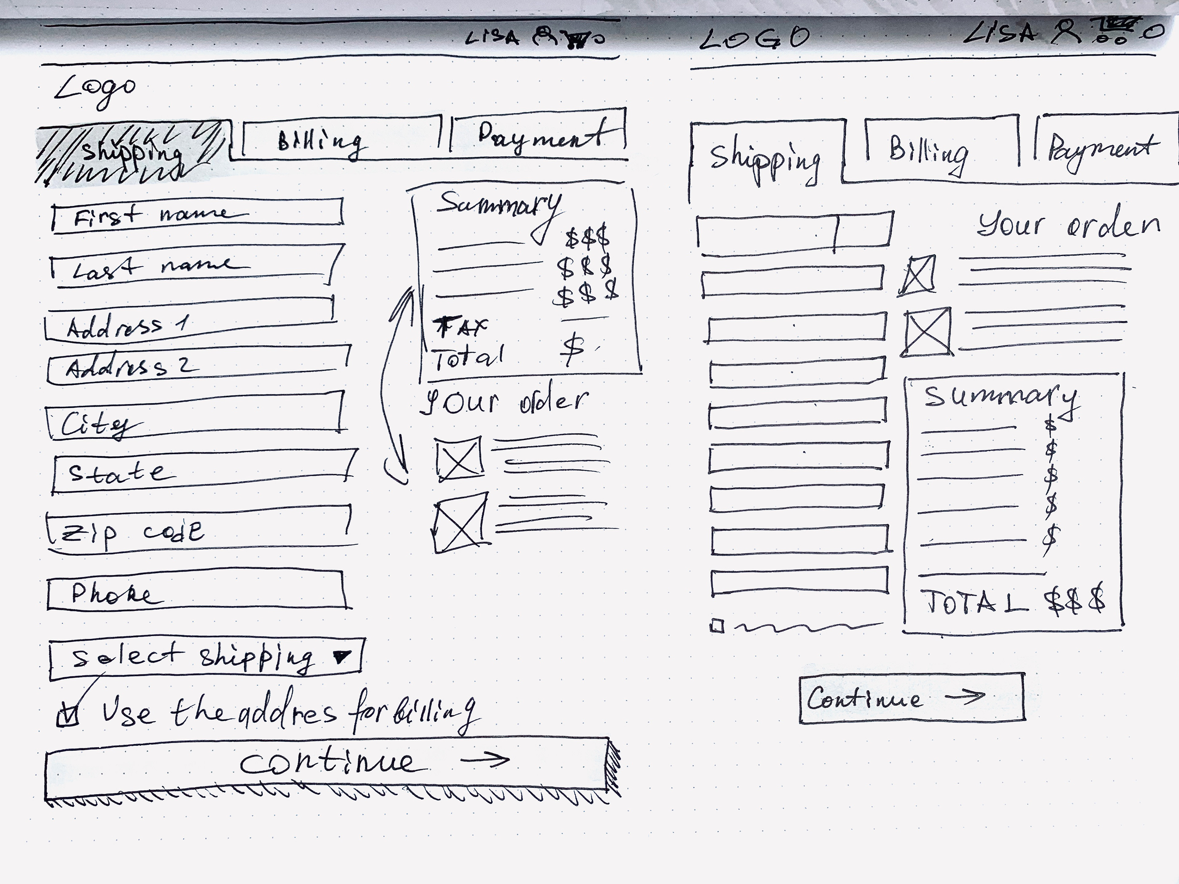
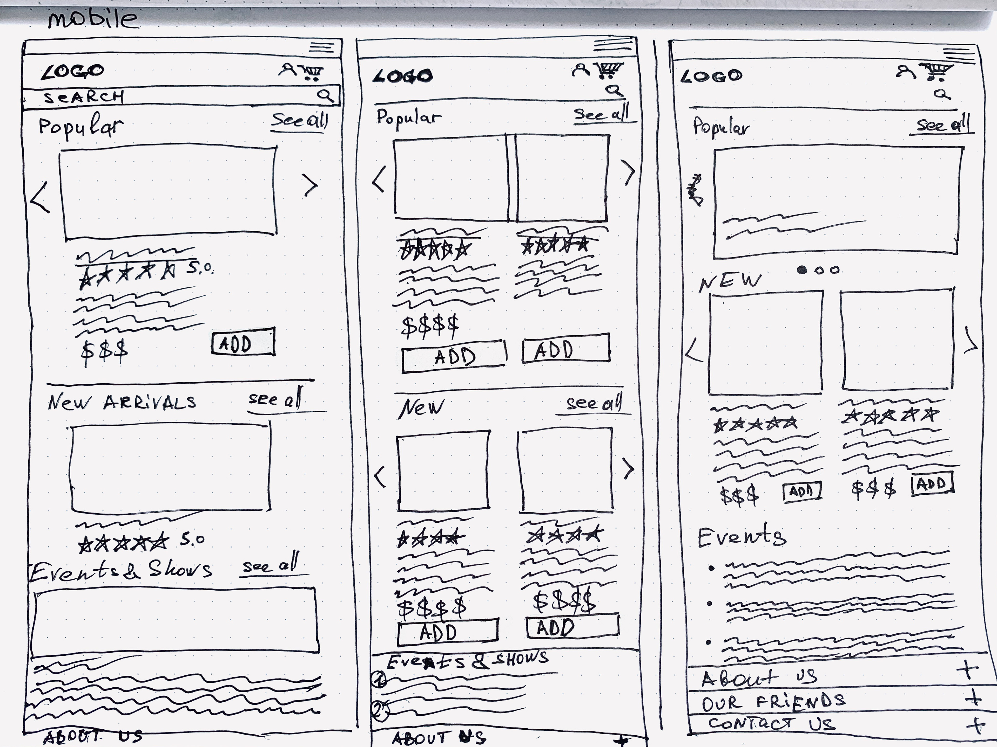
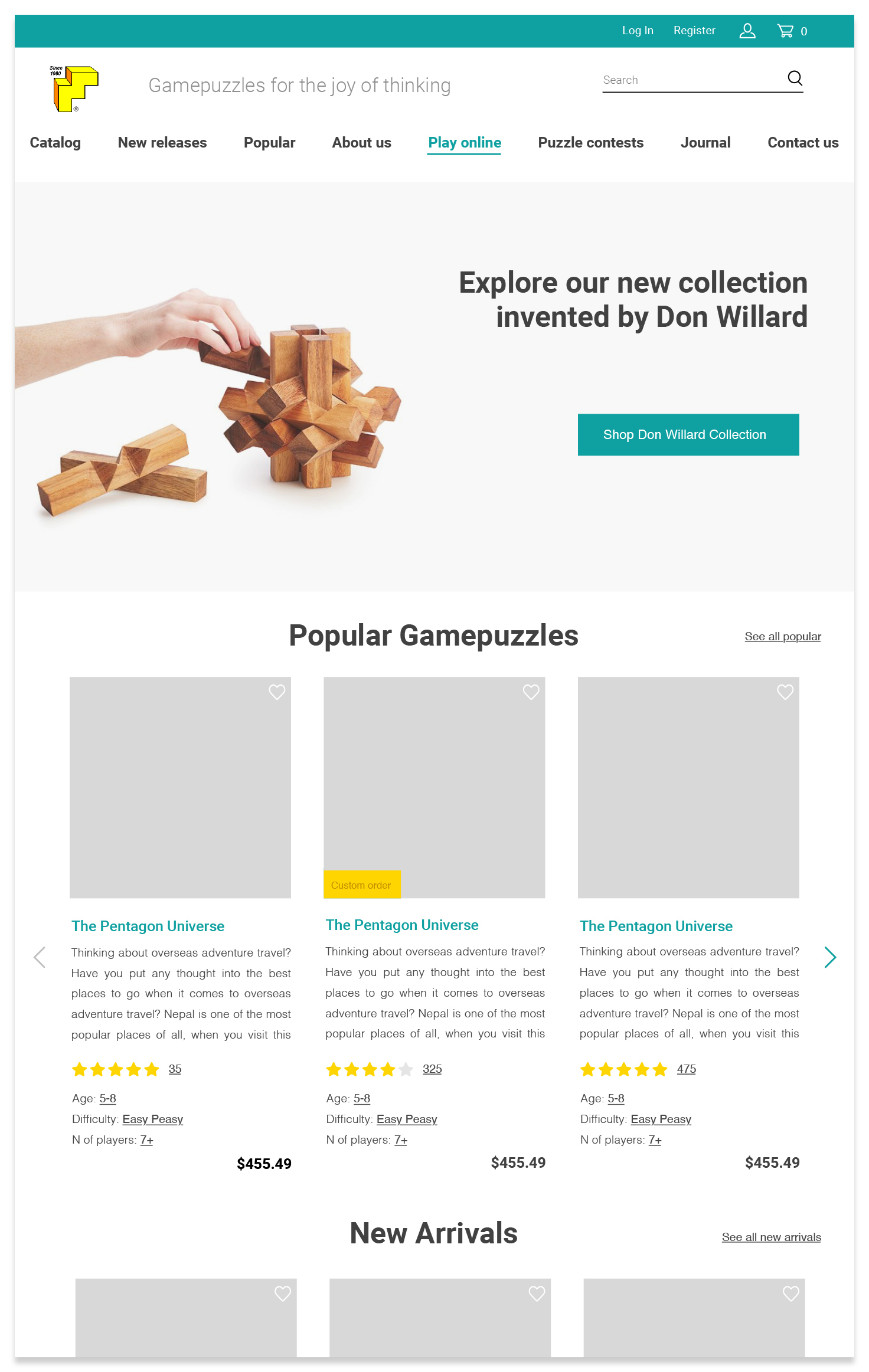
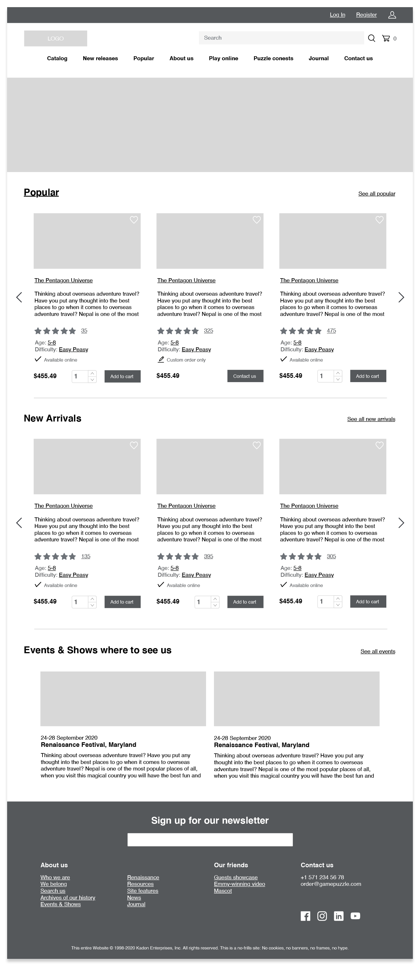
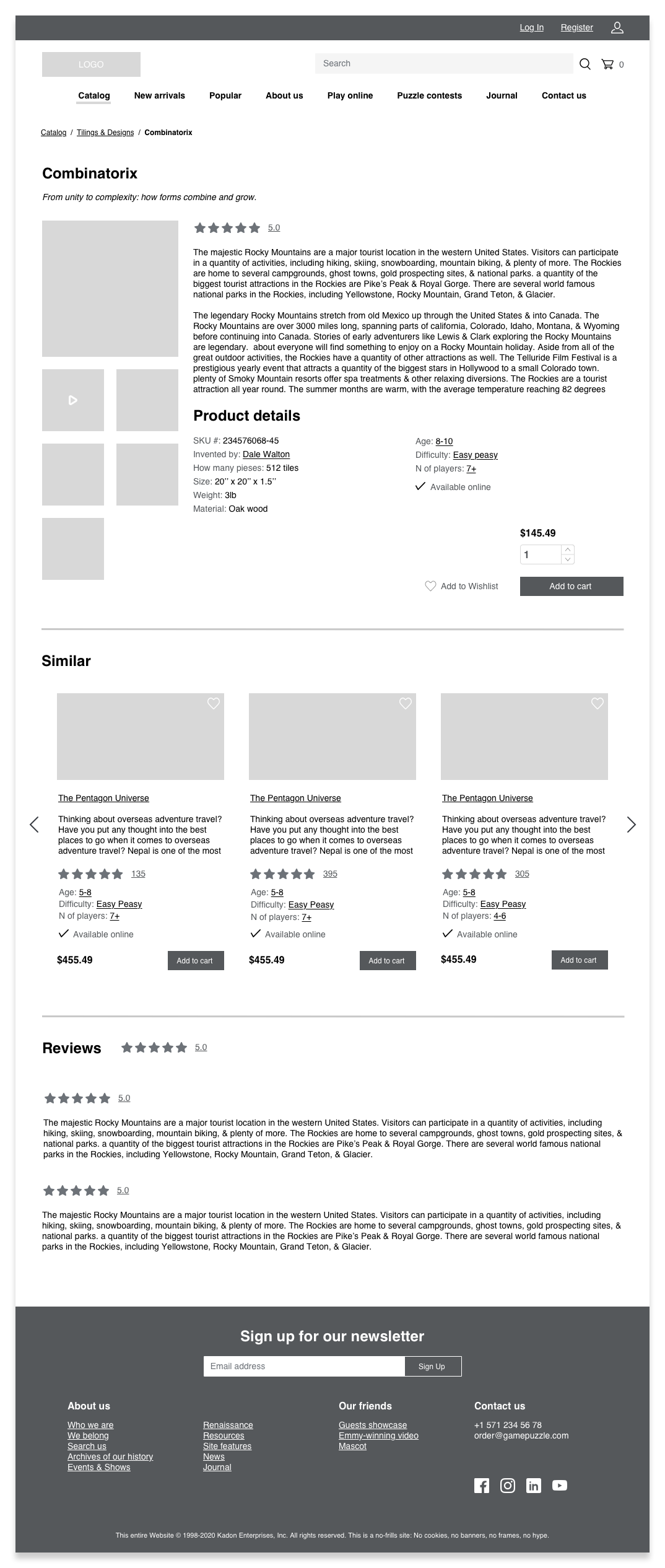
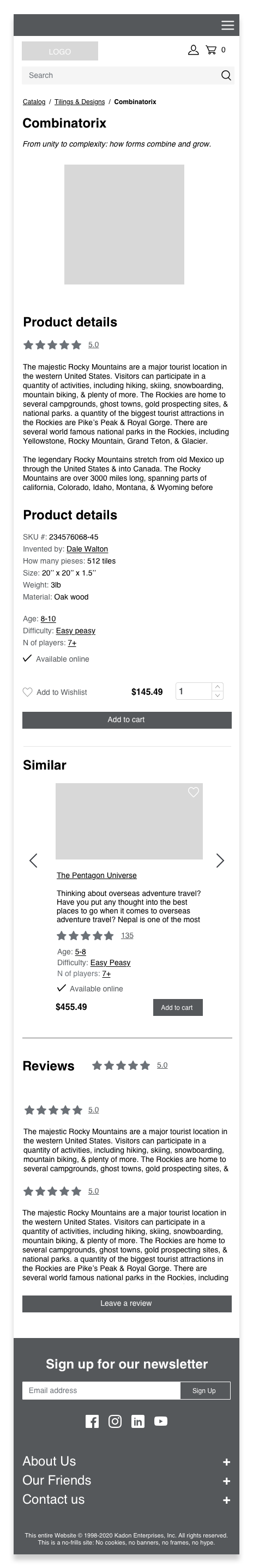
Wireframes
I drew the high fidelity wireframes using the Sketch App, created the prototype and then exported it to InVision App, using Craft plugin. Now I needed to conduct the usability test to see if my ideas work.

Prototype and Usability Tests
Usability test scenario: "Locate the catalog with the games, in the category called "Tilings & Designs", select the cheapest game for age 9, and read the product description and reviews, add this game to the cart, proceed to the checkout, login and proceed to the Payment. "
I performed 3 remote unmoderated usability tests. I found out that my idea is working and it is solving my users problems. Users were able to easily accomplish basic tasks the first time they encounter the design. They were able to accomplish the scenario in less than 5 minutes. Below you can see the Journey Map, I created right after the usability test.
Based on the users comments I added some minor iterations and you can see my prototype here:
Mockup and Next Steps
In my next steps I would like to spend more time on analyzing, regrouping and removing unnecessary information from the website. I would repeat the cart sorting. Then I would continue my work on my mockup by adding customized icons and buttons, fonts and design new pages. I would also focus on the new features that will solve my secondary persona's problems.