Project Overview
An e-commerce inventory management system designed for clothing and shoe retailers. The goal was to give store operators a fast, reliable way to track stock, update product information, and manage inventory in real time - without the friction of legacy tools or manual workarounds. I was part of a cross-functional team, responsible for end-to-end UX and UI design.
The problem
Retail staff were losing hours every week to slow, error-prone inventory updates.
Retail operators and inventory managers were spending significant time on manual stock updates - editing product details, adjusting quantities, and reconciling discrepancies across SKUs. The existing workflow was fragmented and frustrating, creating bottlenecks that affected both store operations and the customer experience.
The core challenge: how do we make inventory editing fast, accurate, and intuitive for non-technical users?
Research & discovery
I talked to the people doing the work before touching a single screen.
I led user interviews with store operators and inventory managers to understand their real workflows, frustrations, and workarounds. Rather than jumping straight into solutions, I advocated for this research phase as a non-negotiable foundation - a perspective I brought from experience knowing how costly assumptions can be later in the process. Key themes emerged quickly: users needed fewer clicks for common tasks, clearer confirmation when changes were saved, and better at-a-glance visibility into stock status. Alongside this, I ran a competitive analysis of existing inventory tools to identify established UX patterns, market gaps, and features users had already come to expect - turning findings into strategic inputs, not just inspiration.
Brainstorming & Ideation
I explored three fundamentally different approaches before committing to one.
I facilitated ideation sessions that explored bulk editing flows, inline table editing, and dedicated product detail pages — each with distinct tradeoffs in speed, error prevention, and learnability. Part of my role as senior designer was to keep the team from anchoring too early on a single solution, creating space to stress-test assumptions and consider edge cases before committing to a direction. Ideas were evaluated against the user's primary jobs-to-be-done: updating stock quantities quickly, editing product attributes in batches, and catching mistakes before they went live. This strategic alignment shaped the design direction before any wireframes were drawn.
Design process
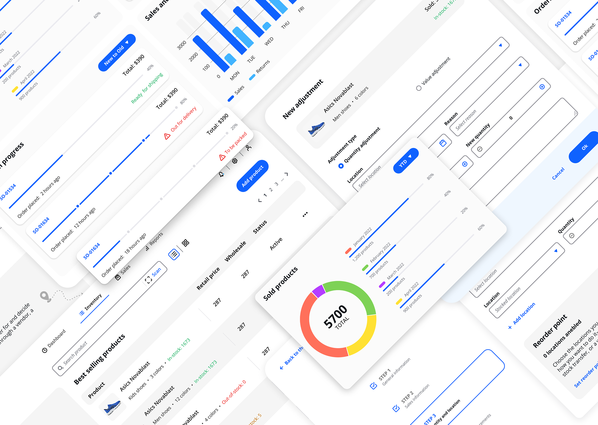
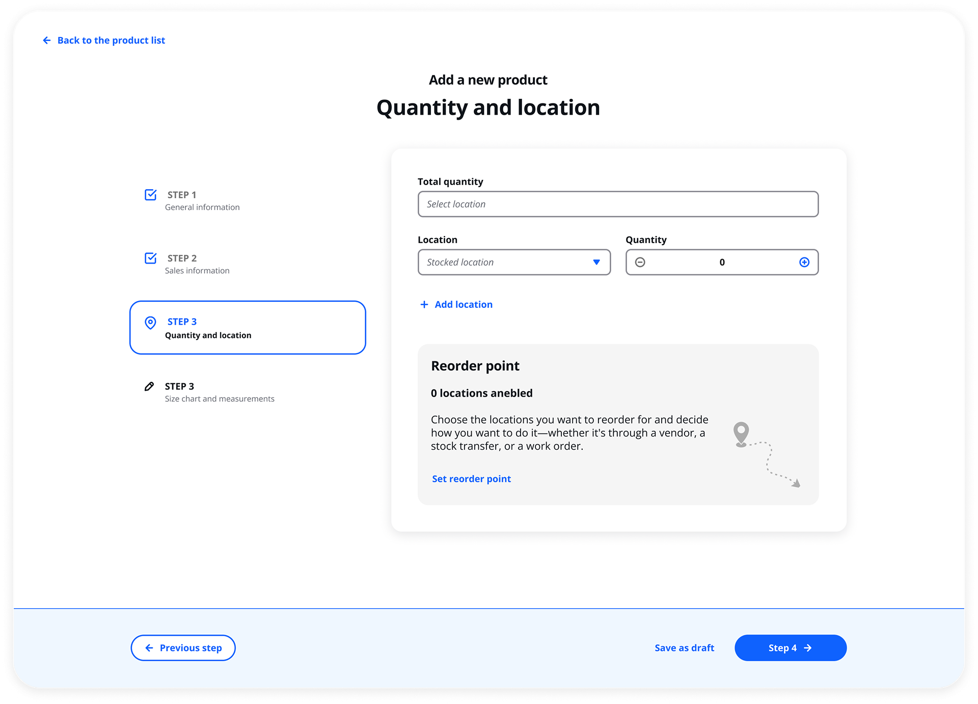
The design moved from rough flows to a clickable prototype across four stages.
I owned the design process end-to-end - from defining the information architecture to delivering production-ready UI. User flows and journey maps identified where the current process broke down and where steps could be eliminated. Lo-fi wireframes focused on structure and hierarchy, with speed of navigation as the primary constraint. A key part of my contribution here was setting the design quality bar and establishing patterns that could scale consistently across the product. High-fidelity mockups established a clean, data-dense UI that balanced information density with readability. Finally, a clickable prototype simulated the key editing flows and was used for feedback rounds and stakeholder reviews.
Key design decisions
Every major UX choice was made to reduce friction for the most common tasks
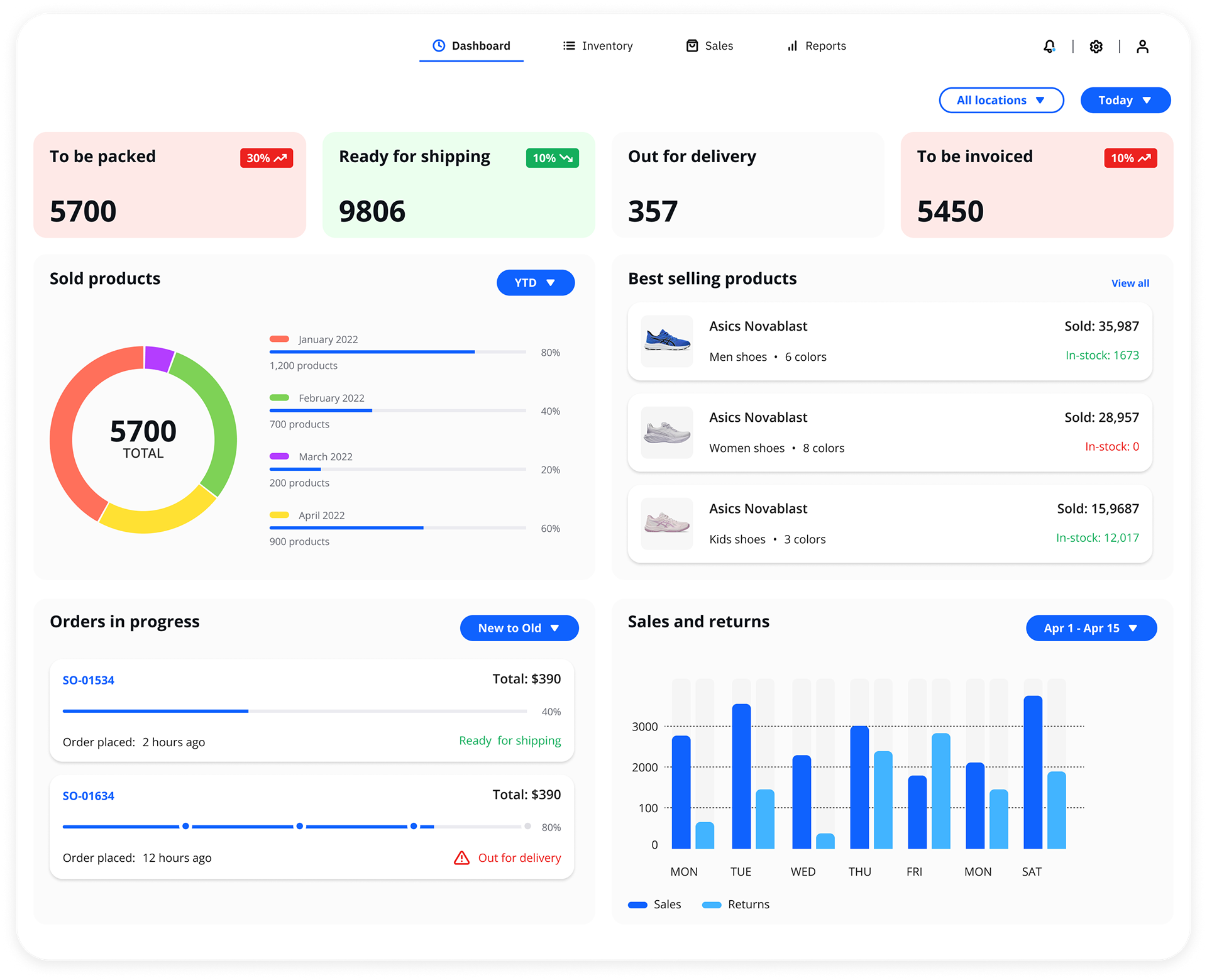
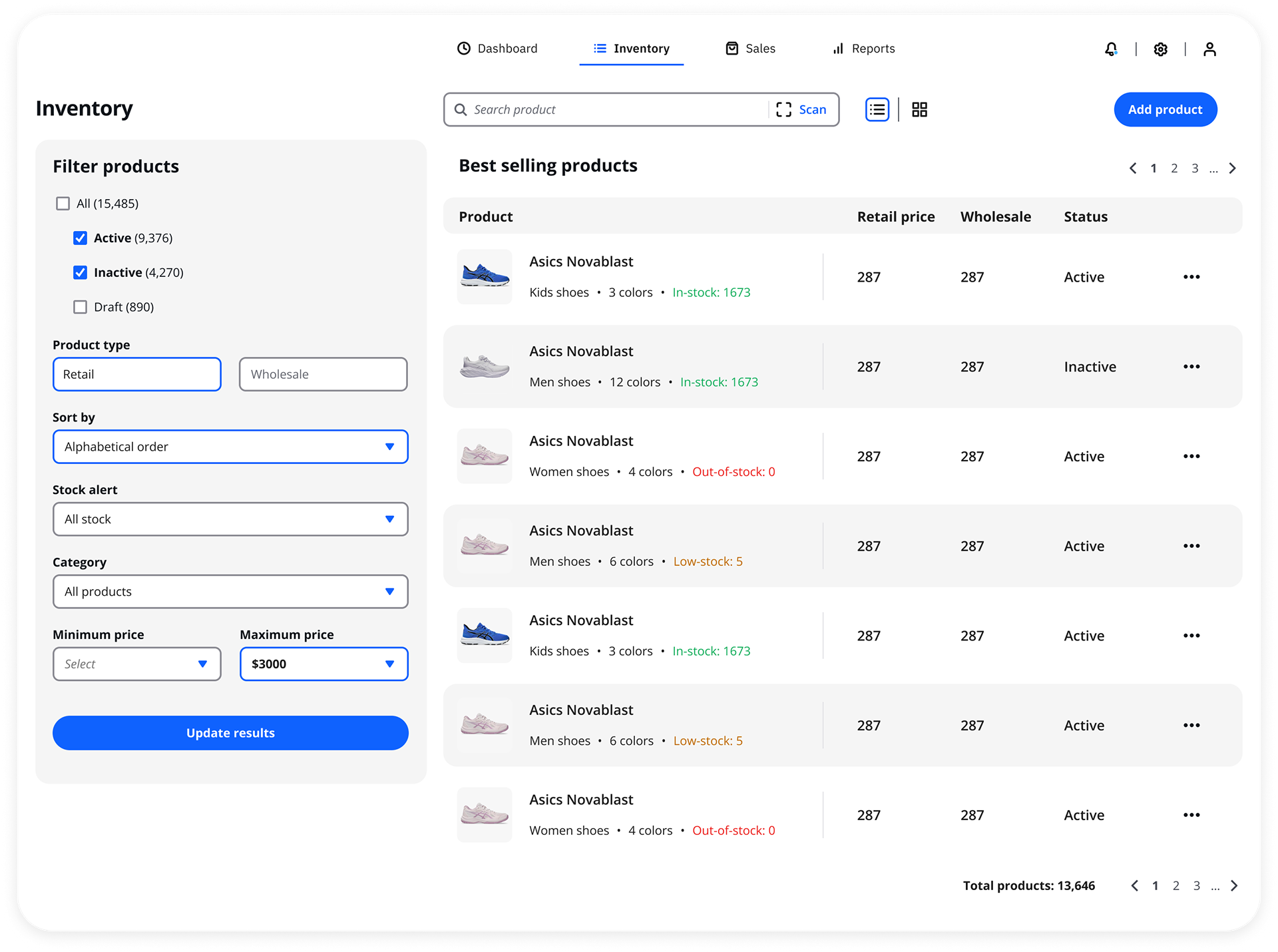
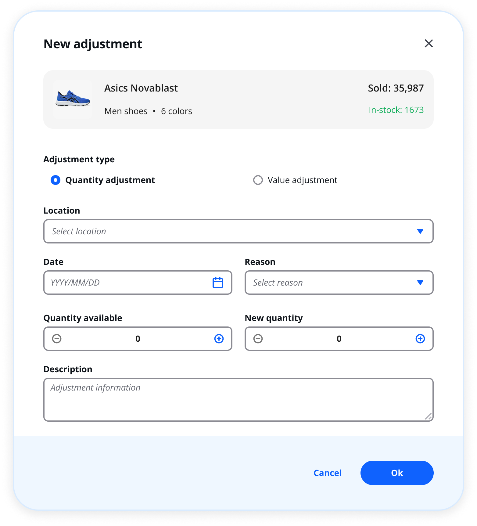
Design work isn't just about making things look good - it's about making principled decisions and being able to articulate the reasoning behind them. Inline editing replaced modal-heavy flows, allowing users to update inventory details directly within the list view and cutting the number of clicks for everyday tasks. Stock status indicators - low stock, out of stock - were surfaced in the main table rather than hidden behind filters, giving operators immediate awareness at a glance. Bulk selection and batch editing were treated as first-class features, essential for retailers managing hundreds of SKUs. Each of these decisions was grounded in research findings and pressure-tested against real user scenarios before being locked in.
Feedback & Iteration
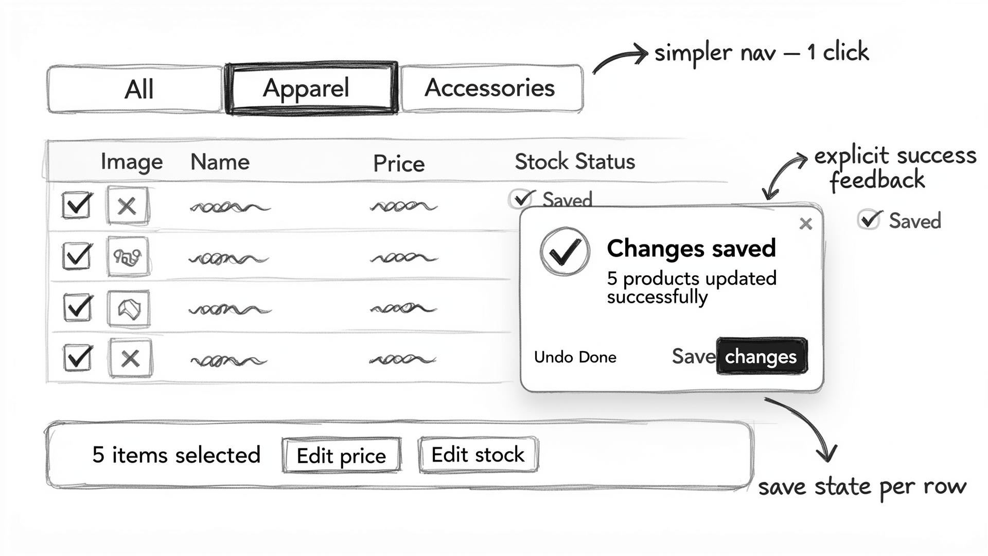
Feedback revealed that users needed more confidence that their changes had actually saved.
After sharing the prototype with stakeholders and internal reviewers, it became clear that the bulk editing confirmation step wasn't reassuring enough - users weren't sure their changes had gone through. I synthesized the feedback, prioritized what to act on, and guided the team through the iteration - a core part of the senior designer role that goes beyond just making the fixes. Save states and success feedback were made more explicit in response. Navigation between product categories was also simplified after reviewers found the original structure required too many steps to switch contexts.
Final solution & Outcomes
The final design cut the steps required for the most common inventory tasks significantly
The shipped design delivered a streamlined inventory management experience tailored to the pace of retail operations — fast to learn, efficient to use, and resilient to the errors that had slowed the previous workflow. Beyond the immediate deliverables, I contributed to the longer-term product vision by establishing design principles and UI patterns that the team could build on for future features. Operators gained real-time stock visibility without workarounds, and the bulk editing capability gave larger retailers a tool that matched the scale of their day-to-day needs.
Future vision & AI innovation
AI could take this product from reactive to predictive — and I see a clear path there.
One of the contributions I brought as senior designer was thinking beyond the immediate brief. Based on the pain points surfaced during research, I identified several areas where AI could meaningfully evolve this product: predictive stock alerts that warn operators before a stockout happens, automated data entry that pulls product attributes from supplier files or images, anomaly detection that flags inventory discrepancies in real time, and natural language commands that let users search and edit stock without navigating menus. These weren't blue-sky ideas - they were grounded directly in what users told us slowed them down most. I proposed this vision as a roadmap input, connecting the design foundation we built to where the product could go next.