CASE STUDY
Project Overview
The goal of this project is to design a user-friendly mobile app that will allow students to learn about the Defynance Income Sharing Agreement (ISA) Program, fill out an application form, select a quote, and explore resources. The creation of this mobile app will also address investors' needs by providing performance and status information.

Duration: 3 weeks
Company: "Defynance"
My role:
User interviews
User research
Competitive and Comparative analysis
UX and UI Design
Usability tests
Presentation
User research
Competitive and Comparative analysis
UX and UI Design
Usability tests
Presentation
Problem statement
"People with student loan debt need a personalized guided experience about ISAs so that they feel supported, educated, and less stressed through the entire process."
Discover

Student Loan Debt Crisis
The 44 million Americans in student loan debt collectively hold over $1.6 trillion in debt. And these numbers are growing 10% annually.
Business goals
Defynance’s primary goal takes a new approach to solving the student debt crisis by focusing efforts on ISAs for refinancers, as well as comprehensive resources through their ecosystems module to support them as they build financial stability. Defynance also wishes to attract investors to grow and support this effort.
2 contextual inquiries, 6 user interviews, 9 user surveys
During the users interviews we tried to get to the core of what users are trying to do and to gain knowledge about the challenges users are facing.
Insights and Problem Define

Competitive and Comparative Analysis
I assessed direct competitors' sites and apps to see how they design for their users, as they are likely to be solving similar user needs as we do.
Features direct competitors have, that Defyance doesn’t:
. Personalization of the portal (branding visual elements make users feel secure, help to build trust)
. Short step by step application forms
. Interactive and humanized experience during the application process
. Progress bar during the application process
. Estimated rates after the filling of the application form is finished.
How indirect competitors solved similar problems
I wanted to see how indirect competitors introduce themselves, how they implement an application process, how they lay out questions, what tricks they use to keep users engaged, so users are not abandoning the application and finishing the whole process.
Those apps offer a friendly interactive application experience, with educational and personalized onboarding, they keep users engaged with the short step-by-step application process, one question at a time and simulate the human connection.
Takeaways from Heuristic Evaluation
. Match between system and the real world: The product interface doesn't align to terminology and language familiar to the user
. Consistency and standards: Users couldn't understand conventions and patterns, and had to guess as to what something means
. Flexibility and efficiency of use: Ways of speeding up workflows are not provided, a user who is less familiar with the system needs guidance.
What we learned from Journey Map
. Filling out the application form is not enjoyable - we need to ease and guide users through the long application process
. Quote selection is a big financial decision, we need to provide support to users while they choose a quote
. Resources are helpful and they need to be available at all times
After interviewing people with student loan debt as well as sending out a survey, we synthesized our insights with the affinity diagram to see if there are connections between observations, and to find the patterns in the data.
We identified some key problem areas and findings from people struggling with student loan debt:
. They would like to have multiple routes to access their information
. They would like guidance through the entire student loan process
. They need a way to receive answers to their questions about ISAs.
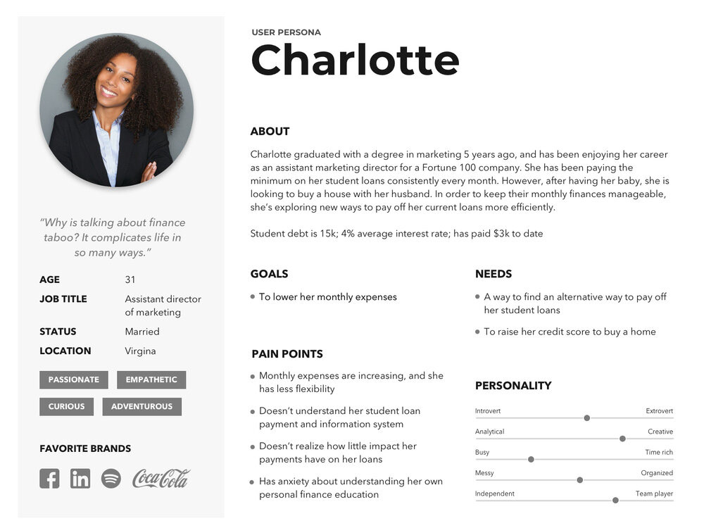
Organizing the data collected during research led us to the creation of a user persona:
How Might We...
... demonstrate the benefits of a Defynance ISA?
... provide an encouraging, personalized, and supportive experience for a refinancer?
... ease fears to prevent users from abandoning the application process?
... communicate informational changes?
After we highlighted the user persona's needs, goals, and pain points, it helped us conclude her problem statement.
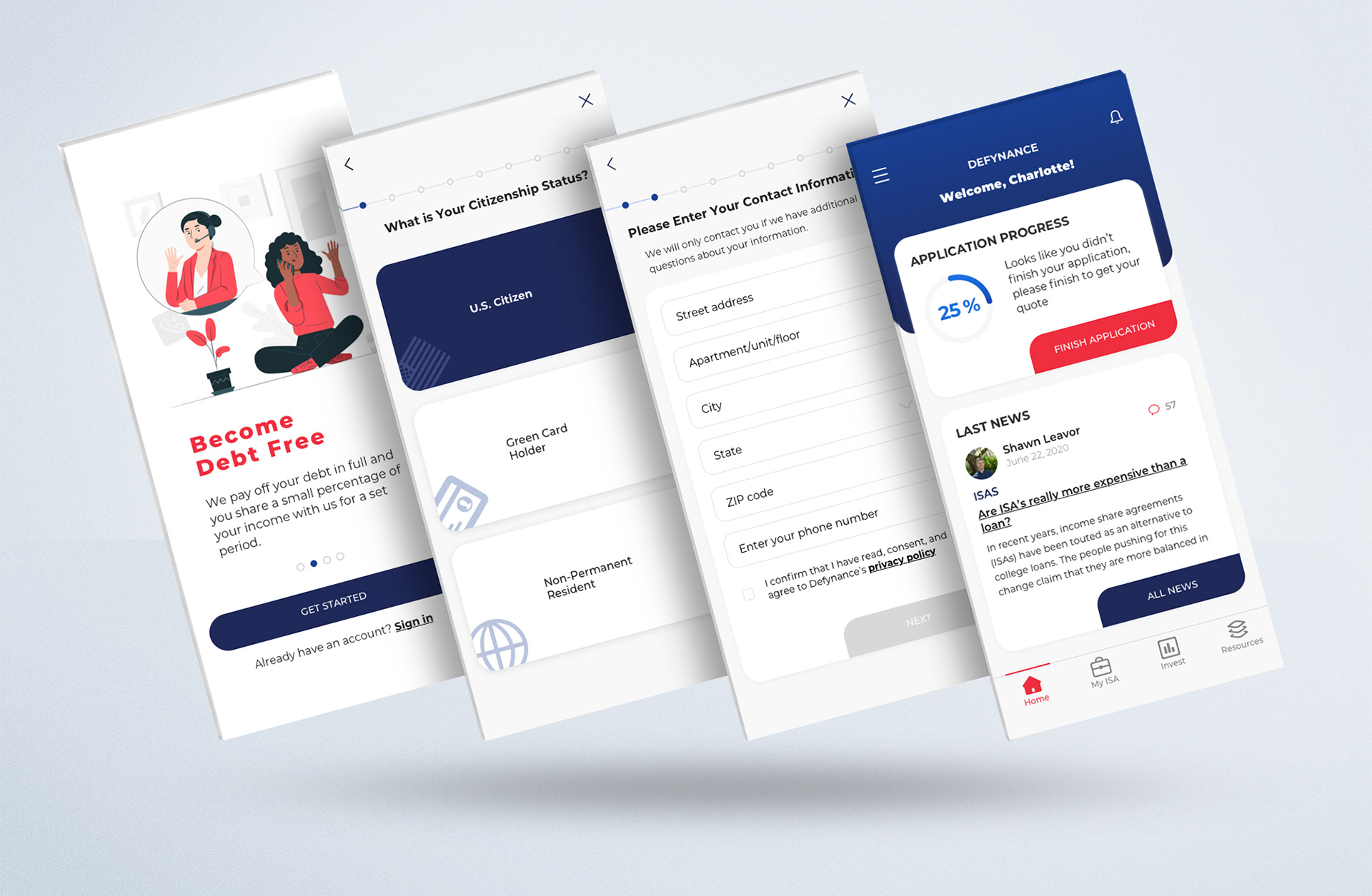
User flow
We created a step-by-step breakdown of what the users will see and do in order to apply for a Defynance ISA:
. Pre-Approval Flow - after the application is filled out, user has to choose a quote
. Approval Flow - here user submits all the documents based on the provided information
. ISA User - when the application process is finished, user can view and manage an ISA account
It helped my design team visualize how users will move through the app ensures everyone is on the same page , as well as create more productive and rewarding work environment.
Ideation & Design

The Design Studio Method
Participation in design studio allowed us to explore a wide set of ideas and also create a shared vision to move forward within a short amount of time. The best way to test ideas and fail forward with the minimum of effort is to create wireframes.
Participation in design studio allowed us to explore a wide set of ideas and also create a shared vision to move forward within a short amount of time. The best way to test ideas and fail forward with the minimum of effort is to create wireframes.
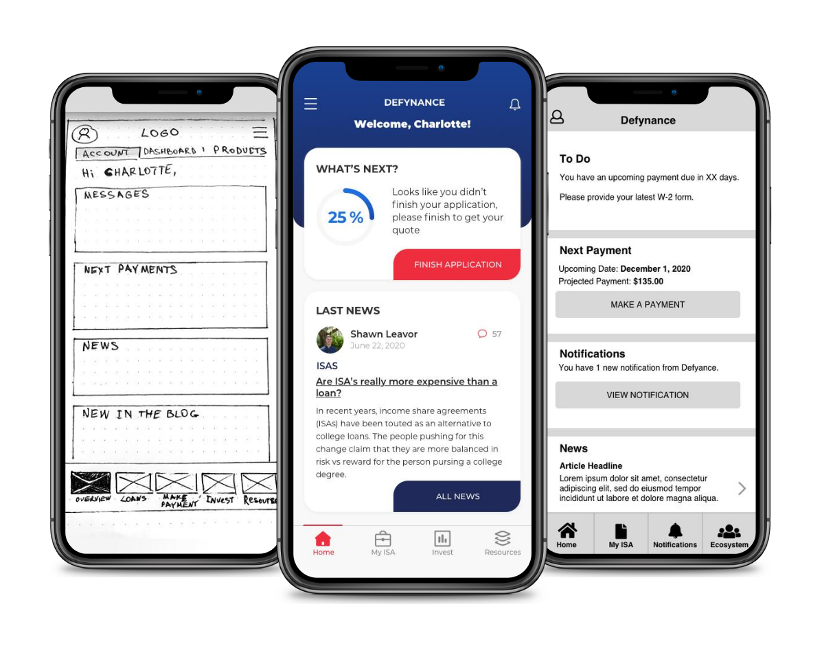
First Prototype and 6 Usability tests
Wireframing process helped us to make sure our team is on the same page, and allowed us to test our ideas out with the target audience, gather feedback at an early stage before we dived deep into visual design. The goal of usability testing was to see how our design met the user’s need for clarity and ease and we also were trying to discover any navigation issues or ambiguous design choices.
What we learned and what we improved
. Users wanted a little more guidance in terms of ‘what comes next’ in the process and they felt unsure what information they would need next, so we added extra steps and wordings to help them to be prepared for the next step
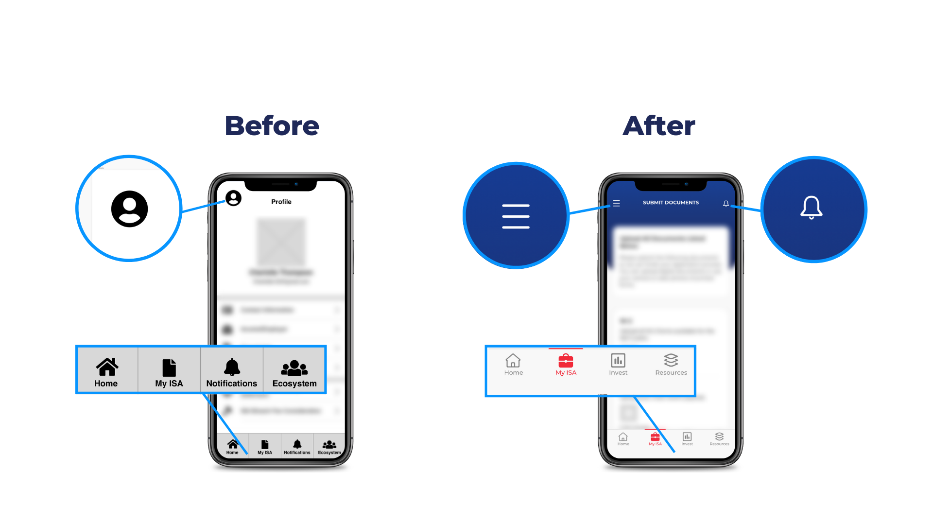
. When users tapped on the profile icon, they were not expecting to see the secondary navigation there, so we removed the profile icon and placed a hamburger menu instead
. Users were confused about selecting a photo from their camera roll for their document upload, so we replaced that with real time capture function
. Word “Ecosystem” was confusing, our team discussed this before, but stakeholders were a little biased, and we decided to leave it as it is for usability test, where our assumptions were confirmed - users did not associate "Ecosystem" with Finances or Resources, so we renamed it for "Resources"
Delivery

Design System
To maintain consistency and making the designer to developer handoff efficient, I started developing a design system based on reusable components and their states, such as forms, list items, and buttons. Every component can be rearranged and combined with others while maintaining design consistency and recognizable UI patterns for the user.
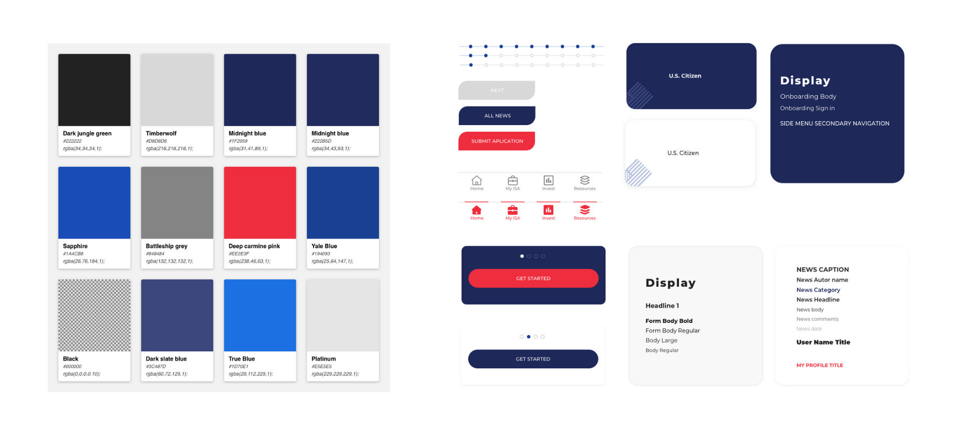
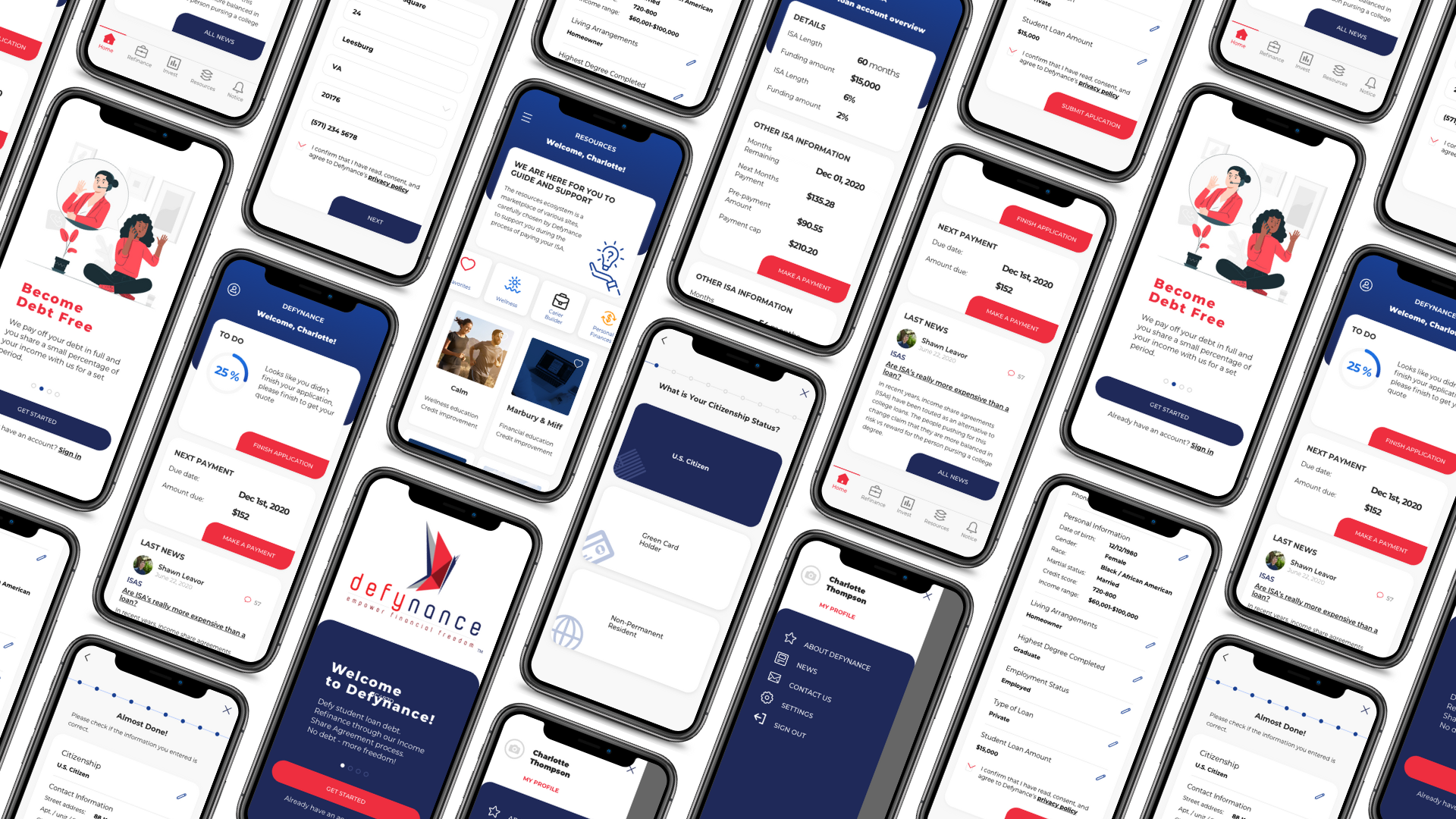
Mockups and Second Prototype
The complex nature of the app necessitated more than 80 screens covering user on-boarding, application process, the quote selection process, the documents approval process, and access to resources that help advance customers’ financial literacy and overall well-being.
Next steps
Because of the time constrains we didn't tested our second prototype, but the user’s feedback should always be welcome, heard and implemented, so on my next steps I would like to do a round of usability tests.